Dimensionality Reduction Playground
Real world data can be big and noisy. High dimensional data refers to datasets where each point contains many features, making it difficult to visualize and sensitive to noise. Dimensionality reduction techniques aim to reduce the dimensionality of the data while preserving underlying structure. Here, we will explore 3 popular dimensionality reduction techniques: PCA, t-SNE, and UMAP.
After exploring the theory of each algorithm through interactive examples, we will apply these methods to some real world data!Toy Example: PCA
Intro to PCA
PCA (Principal Component Analysis) is a linear dimensionaliy reduction technique that identifies the directions (principal components) along which the data vary the most. Algorithmically, it computes the covariance matrix of the data, finds its eigenvectors and eigenvalues, and projects the data onto the top components that capture the largest variance. Since it is a linear technique, it preserves the global structure and distance very well, but cannot morel complex nonlinear manfilds. The main hyperparameter used is the 'number of components', which determines how many principal directions to retain based on the proportion of variance the user wants to preserve.
Drag the points on the plot below to observe how the two principal component directions change.
Drag the line to understand how the first principal direction minimizes reconstruction error, and maximizes variance along the axis.
Credit: PCA by CSE442
Toy Example: t-SNE and UMAP
Intro to t-SNE
While PCA works well for a variety of use cases, it is limited in that it is a linear method, and PCA can struggle to capture these relationships. Here, we will explore the t-SNE method, which ia a nonlinear and probabilistic method that aims to address some of these limitations.
In this section, we will explore the general intuition behind the mehanisms of t-SNE. The algorithm works by first computing pairwise similarity scores in the high dimension, and converting these into probabilistic likelihoods. These are computed by first calculating pairwise Euclidean distances, and are then passed through a Gaussian kernel, normalized, and symmetrized. Intuitively, this is like placing points on a line under a Gaussian curve, and determining the similarity score by drawing a line up to the curve, and then normalizing and symmetrizing. The variance of this Gaussian is related to the "perplexity", which is a key user-specified hyperparameter in the algorithm. In the visualization below, click on a point in the 2D grid to visualize how the similarities are computed using a Gaussian.
Credit: TSNE and UMAP by CSE442
Then, the high-dimensional points are randomly projected into a lower-dimensional subspace, and similarities are computed again using a procedure similar to the above. The main difference is in the low-dimensional space, similarities are computed using a Student's t-distribution instead of a standard normal curve. Then, an iterative optimization procedure such as gradient descent, is run to minimize the differences between the low-dimensional similarities and the high-dimensional similarities.
Intro to UMAP
UMAP (Uniform Manifold Approximation and Projection) is another nonlinear dimentionality reduction method that learns the structure of the data by looking at how points relate to their neighbors in high-dimensional space. It builds a graph of these local relationships and creates a low dimensional embedding that preserves them as much as possible. Compared to t-SNE, it is faster, scales better, and preserves both local and global structure, and therefore, the distance between clusters more reliably reflect real relationships compared to t-SNE. Compared to UMAP, t-SNE focuses almost entirely on the local neighborhoods, so produces more well-separated but losing the global information of the data. Therefore, t-SNE works well in a very tightly clustered visualization, while UMAP provides more balanced visualization between local and global data geometry.
Algorithmically, UMAP constructs a nearest neighbor graph and optimizes a layout keeping clos points to be close while maintaining the overall structure. The hyperparameter 'n_neighbors' sets how broadly the local structure is defined (smaller values lead to focus on local structure, larger values result in more emphasis on global structure) and 'min_dist' determinest how tightly the points can cluster in the embedding (lower values lead to more compact clusters and higher values result in more spread). These hyperparameters enable UMAP to balance local detail and global organization. On the other hand, as we have seen above, t-SNE converts pairwise distances into probability distribution (e.g., Gaussian kernels and Student t-kernels) and optimize the embedding by minimizing the KL divergence between these distributions. This probability-based formulation in t-SNE strongly emphasizes local neighborhoods and lead to slower, and less scalable visualization.
In above visualization, the left plot shows a 2D projection of the 3D Swiss roll, where the manifold curls and overlaps itself. The right plot shows the UMAP embedding, which successfully unrolls the nonlinear structure into a continuous 2D space while preserving local neighborhoods. The smooth color gradient indicates that UMAP preserves both local and global geometry.
t-SNE vs UMAP: Hyperparameter Exploration
In the following visualization, we will compare how t-SNE and UMAP perform on a small synthetic dataset. The three-dimensional data in the first panel are randomly generated points, sampled from different Gaussians with varied means. Explore the structure of this data and experiment with adding more clusters!
Then, observe how the t-SNE and UMAP embeddings cluster the data. Notice that t-SNE tends to prioritize more local relationships within clusters, while UMAP tends to preserve the global structure of the data a bit more. Also, experiment with the different settings of hyperparameters to understand their effect on the output!
High-Dimensional Data
T-SNE Embedding
UMAP Embedding
Credit: TSNE and UMAP by Tanya
Case Study: Fashion MNIST
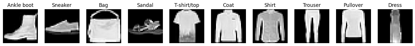
FashionMNIST is a dataset of various grayscale images of 10 clothing item classes. Note that images vary within a given class, and some can look more ambiguous than other.
Here, we randomly sampled 5000 images from the dataset and represent each 28 x 28 pixel image as a flattened vector with 784 dimensions. Each value in the vector encodes the pixel's grayscale intensity. In the subplots below, we reduce each size 784 image vector into 3 latent dimensions using PCA, t-SNE, and UMAP. Each point here represents a single dimension-reduced image in 3d space. Points are colored based on the class of their corresponding original image.
Currently, a subset of clothing item classes are identified: select more options to see how the classes overlap/cluster in 3d space. Hover on each point to see what clothing item they represent!
- What do you notice about points from different classes that tend to cluster near each other?
- How do the shapes of clusters differ depending on the method? Does this make sense given the description of each algorithm given above?
Source: FashionMNIST Comparison
Case Study: Neural spike trains
Background
Place cells are neurons in the CA1 region of the hippocampus that tend to selectively fire (i.e. emit electrical pulses) when an animal enters a certain location: this is thought to be useful for navigation. Researchers can record hundreds of neurons simultaneously as an animal navigates an environment, facilitating the study of such patterns.
Our visualization
Here, we visualize data from Yang et al., 2024, which contains the spike times of hippocampal neurons in rats as they navigate a figure-8 shaped maze. This dataset consists of a time series, where each time interval is described by 482 values: the instantaneous firing rates of the 482 neurons recorded.
In the visualization below, we apply the dimensionality reduction algorithms discussed above to reduce each 482-dimensional data point into just 3 dimensions. On the left, we display the rat's position on the maze overtime. On the right, we show the corresponding 3D neural activity embeddings, colored by the position.
Click Play to see how the the embedded representations evolve as the rat traverses different areas of the maze, which have been color coded by region, and use the buttons at the top left to switch algorithms: